TableShare Case Study
Preventing Customer Loss by Making Café Seating More Conducive to Coworking
Branding to encourage sharing
Select a table to share with others
Offer seats at your table to others
Overview
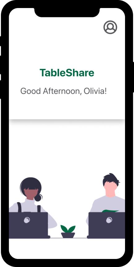
What is TableShare?
Imagine you enter your favorite café to work at. As you look around, you notice ALL the tables are filled — by ONE person. Should you ask to share a table? Everyone looks busy and somewhat uninviting. So, you turn to leave. This happens repeatedly throughout the day, wasting the time of others like you and resulting in lost profits for café owners.
TableShare solves this pain point by allowing users to find a seat with those willing to share their table or offer their table to those in need of a seat.
Goal
Prevent customers from leaving a café when all the tables are occupied by making tables more conducive to coworking.
Role
- Conducted and synthesized user research
- Developed user flows, sketches, wireframes and high-fidelity, interactive prototypes
- Conducted usability testing
Summary
Once I understood what made for a productive learning environment for adults via user interviews, I could identify areas of opportunity. I was able to deduce that adults at cafes typically work alone but are willing to share their workspace with other focused workers. I chose to facilitate indicating a customer is willing to share their table and finding a table to share through a mobile application. This MVP may be furthered with options for rewards programs, ordering, payment and building collaborative communities.
Prototypes of TableShare Features
Discovery & Synthesis
Research & Analysis
In order to keep a customer at a café, I needed to understand why an adult student or worker would or would not consider working at a café in the first place.
Potential user interviews and analysis revealed:
- Adults studying and working at a café typically work alone but are willing to share their workspace with other focused students and workers.
- The opportunity to provide a more consistent and predictable café environment
Design & Refine
Ideation
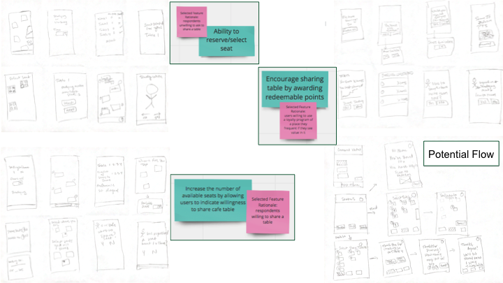
Based on the results of my analysis, I decided to focus on:
- Eliminating the discomfort associated with asking to share a table at a crowded café
- Lowering the amount of time spent looking for a table
- Lowering the chances of a potential customer leaving
These goals could be addressed by focusing on a few features from my ideation session:
- The ability to reserve/select a seat
- Increasing the number of available seats by allowing users to indicate their willingness to share a café table
- Encourage sharing a table by awarding redeemable points for sharing
Sketching
I explored each feature further through the brainstorming sketching method, crazy 8’s.
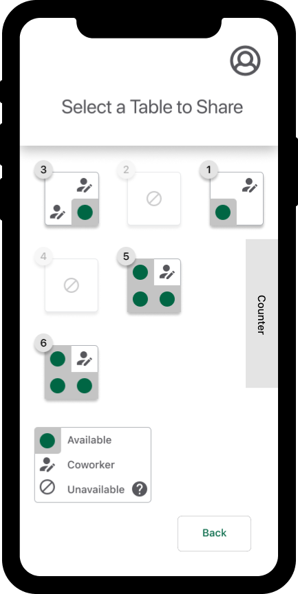
I decided to move forward with a visual depiction of the seating area. This would allow users to quickly interpret what was happening in the café. This depiction would be a hybrid of 2 sketches that allow a user to pick their table but not their seat, as that would offer additional, unnecessary constraints.
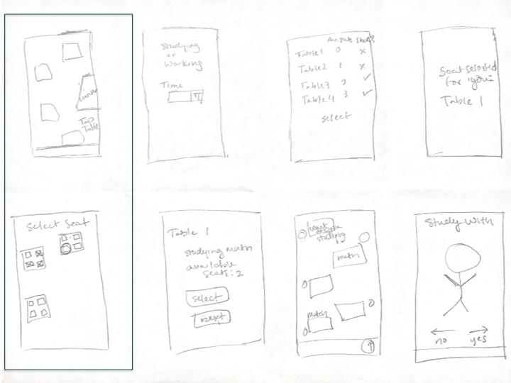
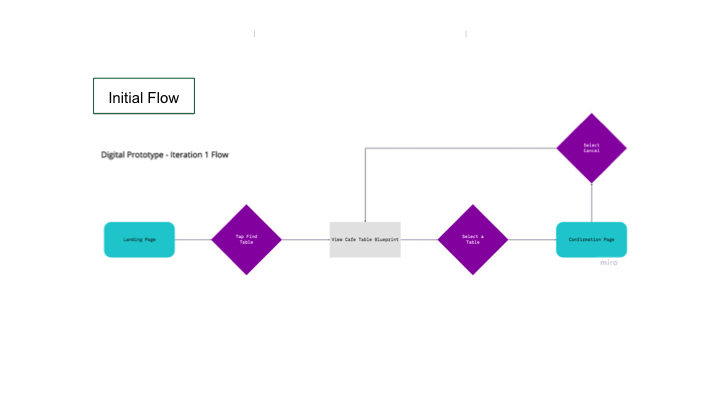
Prototyping — Lo–Fi Iteration 1
My first prototype focused on finding and selecting a table with at least one other person who is already seated and willing to share their table at a crowded café.
Remote, Moderated Usability Test & Feedback
Testing revealed that the prototype failed to communicate:
- Who the app was for (sharing a table with others)
- The options the user had in the flow (the “spaces” indicated room for a user but not that their were others present)
- Confirmation of the selected table (the user was unsure their space was selected and that they completed the task)
Consequently, I iterated over the initial flow to add an additional page so users understand the 2 table types: 1. vacant or unoccupied 2. available to share with others
I also added a back button to allow users to exit the flow and find a vacant table instead of a shared table.
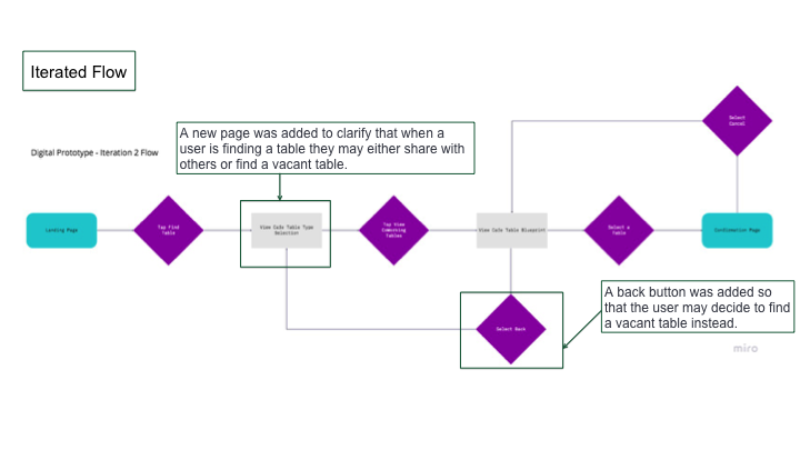
Prototyping — Lo–Fi Iteration 2 — Implementing Feedback
Iteration of the user flow led to the iteration of the low–fidelity prototype.
The second iteration of the Lo–Fi prototype:
- Simplified the navigation
- Presented the user with clearer options of table type
- Added text to help the user understand there are others at the table
- Added clearer status messages
- Utilized fading/disabling and secondary buttons to further clarify the user’s options
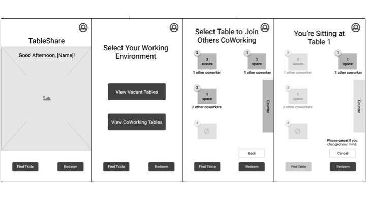
Prototyping — Hi–Fi Iteration 1 — Preparing for Additional Testing
I began to increase the fidelity of the second iteration of the Lo–Fi prototype in preparation for more usability testing.
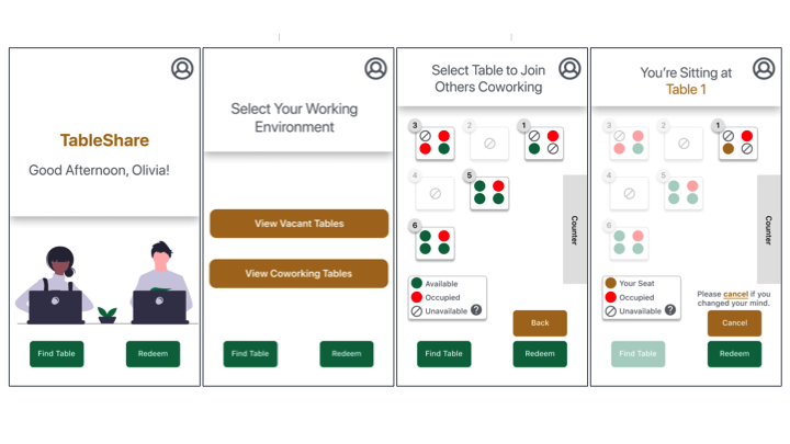
Prototyping — Hi–Fi Iteration 2 — Accessibility Assessment
I assessed the accessibility of the first Hi–Fi iteration and updated accordingly.
Majority of the changes involved:
- Updating the color contrasts to have a WCAG AAA rating
- Creating a secondary and tertiary button
- Using symbols/icons for clarity
- Updated messaging
Remote, Unmoderated Usability Tests & Feedback
Eleven remote, unmoderated usability tests revealed several opportunities for improvement as 80% wanted to tap to find a vacant/unshared table when only shared tables were available and 60% were notably confused by the ‘Redeem’ button.
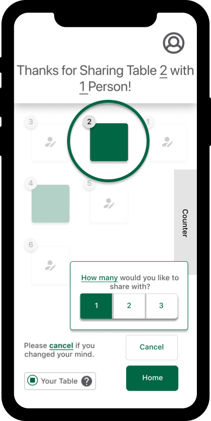
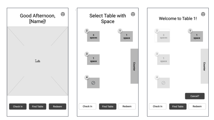
Prototyping — Hi–Fi Iteration 3 — Implementing Feedback
The majority of the resulting updates included:
- Adding real-time status messaging so respondents always understand their options
- Removing navigation buttons including the ‘Redeem’ button so users are not confused about their options
- Adding an alert overlay to draw users’ attention and understanding that they are in the process of reserving a table
- Simplifying messaging
- Adding a status update to the homepage regarding the selected table for the user
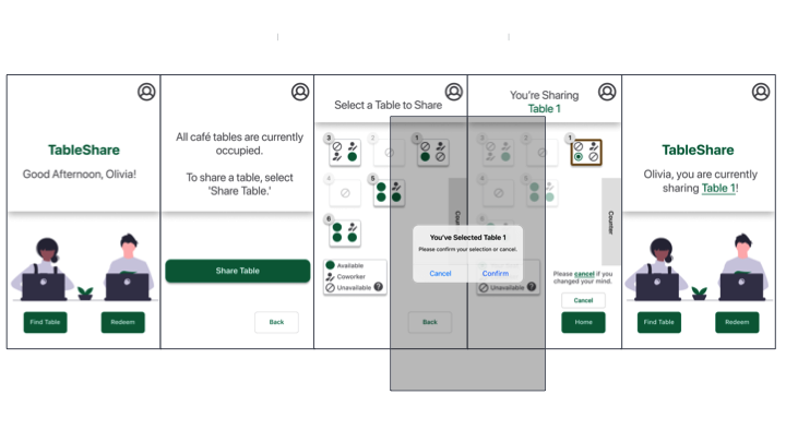
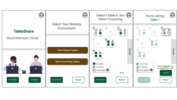
IMAGE — Final Layout of Hi–Fi Iteration 3
Prototyping — Hi–Fi Iteration 4
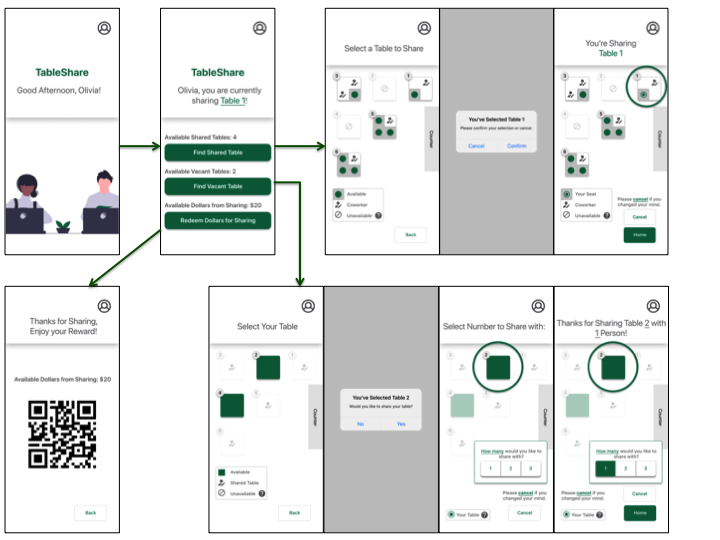
For the fourth Hi–Fi iteration, I wanted to address the landing page. I updated the screen to provide users with real–time information about the café and their points accumulated from sharing tables, redeemable as dollars. Additionally, I updated the symbols and components to make options, the flow, and state changes clearer.
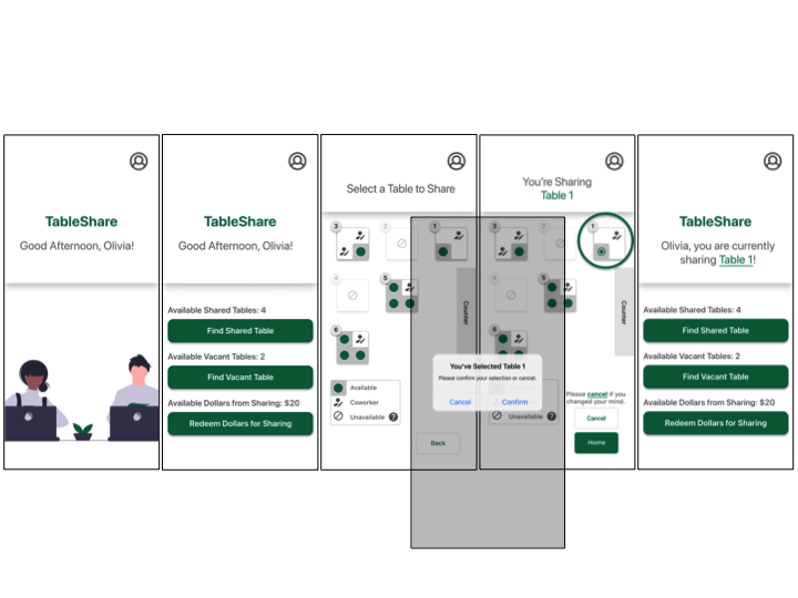
IMAGE — Hi–Fi Iteration 4 Updates
Once I had the symbols and components in place, I was able to iterate over the sketches for the other two features. I developed Hi–Fi wireframes for users to offer to share their table and redeem points as dollars for sharing their table.
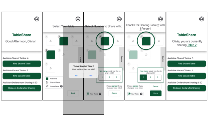
IMAGE — TableShare Share Your Table Feature
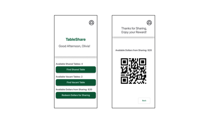
IMAGE — TableShare Redeem Feature
Retrospective
TableShare could prevent customers from leaving a crowded café if others at the café are willing to share their space. This MVP may be furthered by exploring the rewards programs, in–app ordering and payment and building collaborative communities.
What went well?
- Using UI Kits for wireframing and iPhone iOS components allowed for faster and, eventually, more realistic prototyping.
- Usability testing brought out significant pain points to address, allowing me to make significant improvements in the iterations directly after testing.
Areas for Improvement
- It was sometimes difficult to understand how much to prime usability test participants.
- Finding participants to test prototypes was difficult.
Constraints & Considerations
TableShare essentially turns each café table into a potential coworking space. However, this is not permanent. A table’s status is dynamic and may change according to who is seated there. In order to be implemented, TableShare may require at least a part of the café to be devoted to app users.
Next Steps
Explore rewards further, onboarding, ordering, payment and building collaborative communities with TableShare.
Illustrations courtesy of undraw.co