City Cycles Case Study
UX Audit & Redesign of a Reservation System
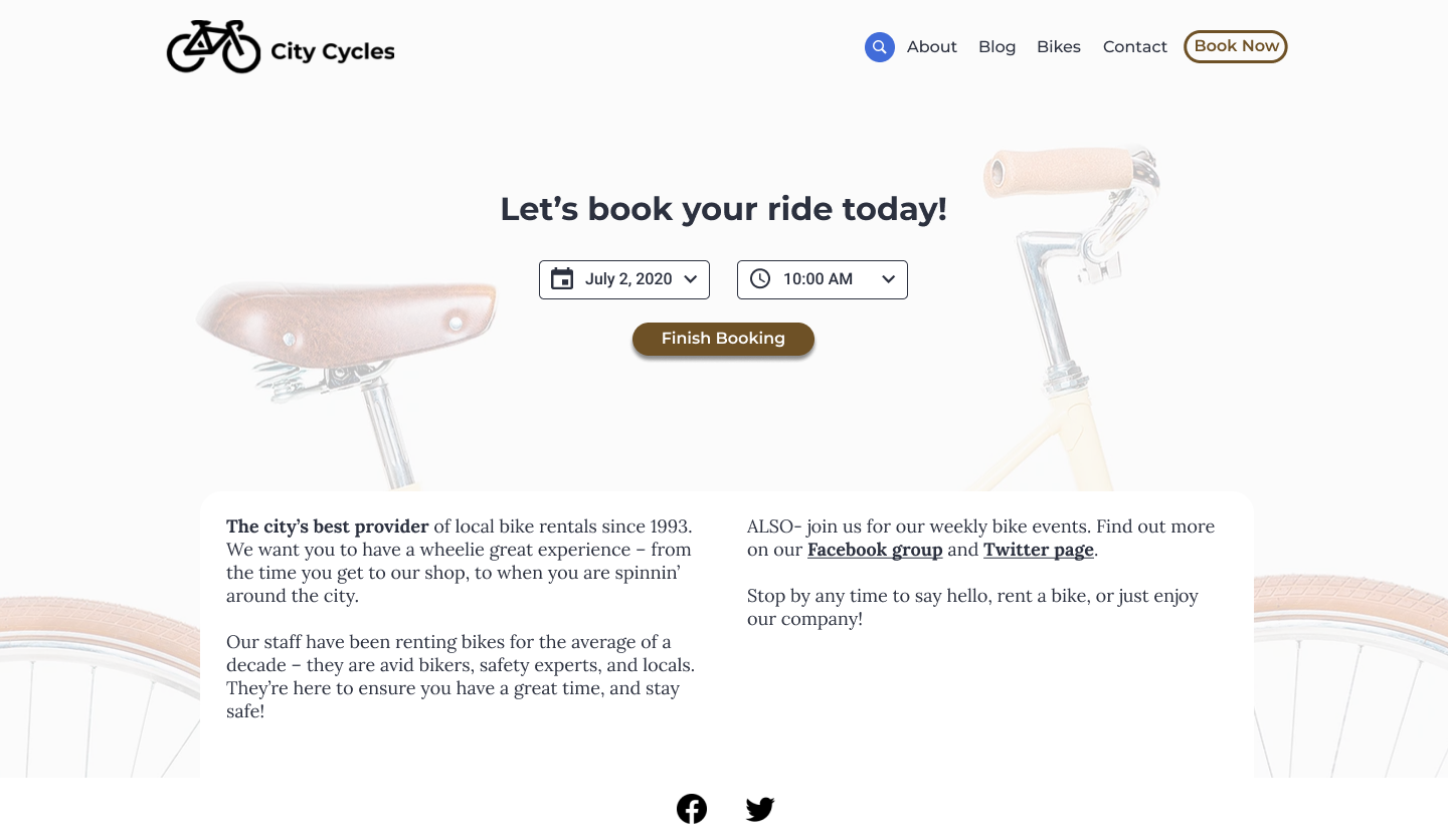
Redesigned to begin booking on landing page
Mobile Redesign
Overview
What is City Cycles?
A fictional bike rental shop in a local downtown area. They allow patrons to make reservations online, by phone or in-store. Visit the original City Cycles’ website.
What are they requesting?
A UX audit to understand why more patrons are not making online reservations and a UX redesign to increase the number of online reservations.
Goal
Increase the reservation conversion rate by creating a seamless reservation system that customers will want to use.
Role
- Conducted user research and heuristic evaluation
- Developed new user flow and wireframes
- Developed high-fidelity, interactive prototypes
- Conducted usability testing
Summary
Through the UX Audit, I determined pain points and opportunities to enhance the reservation system. My UX redesign involved considerations for users’ mental model of a reservation system, progressive disclosure, interaction design and mobile responsiveness and development.
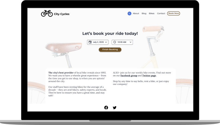
Final Desktop Reservation System
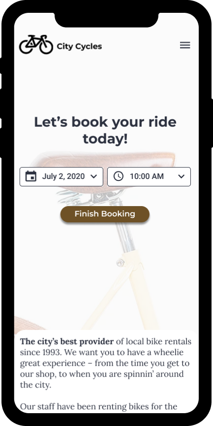
Final Mobile Reservation System
UX Audit — Exploration & Findings
I reviewed analytics and conducted a user interview, usability test, heuristic evaluation and competitive analysis to determine the points of failure and opportunity for the reservation system. I further visualized the findings with the development of a persona and journey map.
Metrics & User Analytics Review
Of the analytics provided in the brief, the reported drop-off of 80% of users during mid-reservation and only 25% of users scrolling to view content below the fold, were of greatest note to me.
Stakeholder Interview Review
The provided brief noted City Cycles’ frustration with fielding excessive phone calls and in-person reservations. These interruptions made it difficult “to provide quality customer service.” Therefore, they would like to know why patrons are avoiding what is in place online.
Conducted User Interview & Usability Test
User research revealed a confusing booking experience in which the reservation flow’s requirements, conflicting directions and labeling bewildered the user.
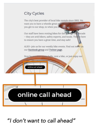
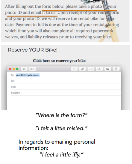
IMAGE — Poor labeling creates weak information scent in the original landing page & reservation flow.
Conducted Heuristic Evaluation
The heuristic evaluation revealed a violation of several heuristics that contributed to an unpredictable reservation flow with high cognitive friction.
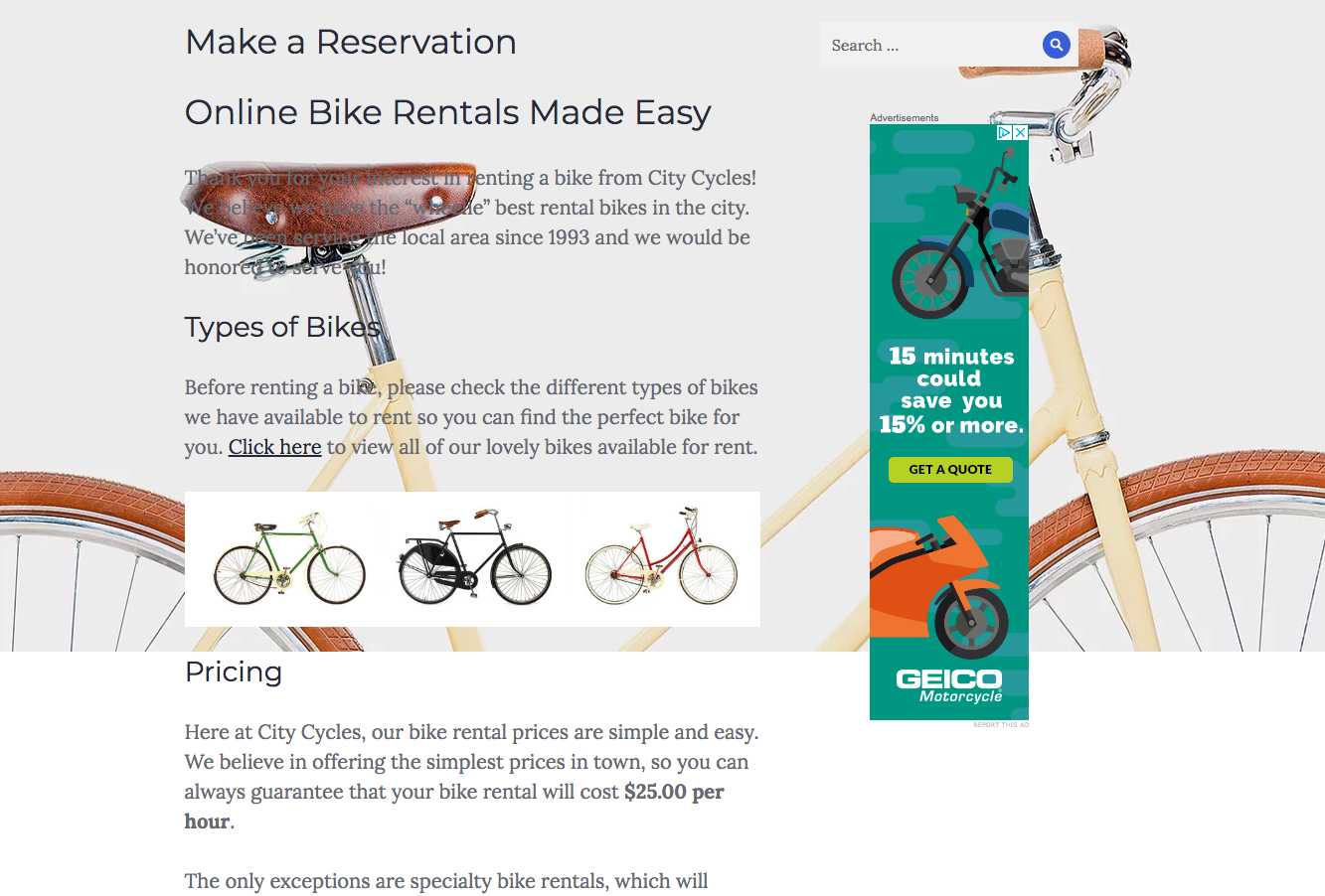
IMAGE — Reservation Information Wall of Text
Developed Persona & Journey Map
A potential City Cycles’ customer attempting to quickly book a bicycle adventure would have an emotional rollercoaster of a journey ending in frustration. The journey map identified issues with the website’s navigation, an excessive number of steps in the flow and a lack of readily available contact information.
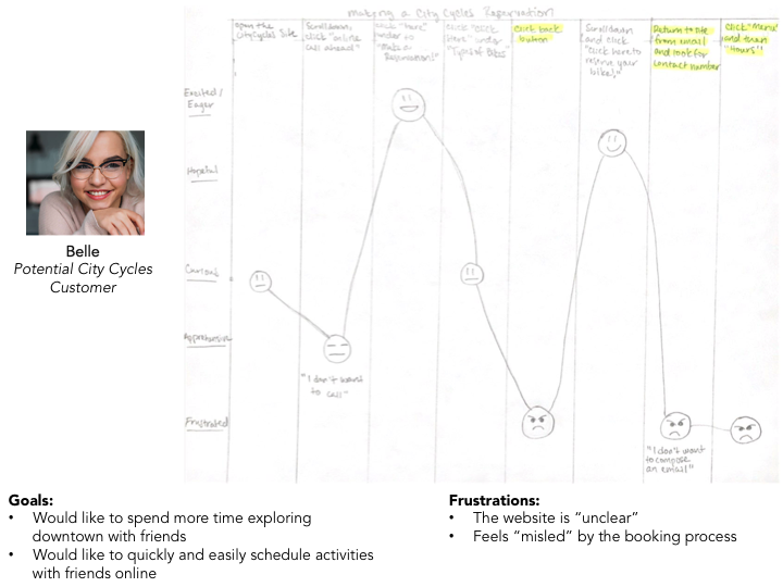
IMAGE — Belle — a potential customer, her goals and frustrations and her journey to rent a bicycle
Competitive Analysis
Reviewing the online rental process for other rental stores revealed opportunities to: 1) create a more flexible reservation system that allowed patrons to book an hourly rate or a daily rate and book quickly 2) create a more visual reservation system
UX Redesign
First Iteration — Homepage Layout
My first iteration focused on addressing the website’s navigation menu, search bar placement and overall homepage layout.
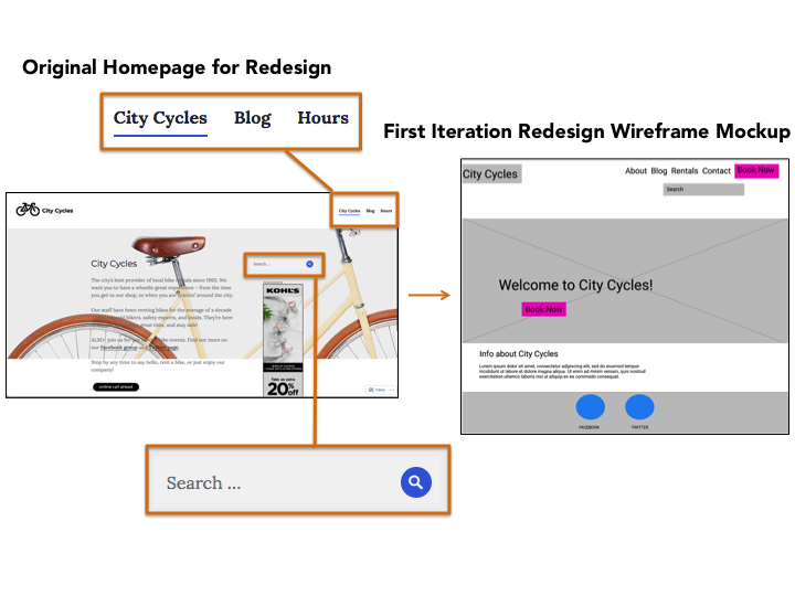
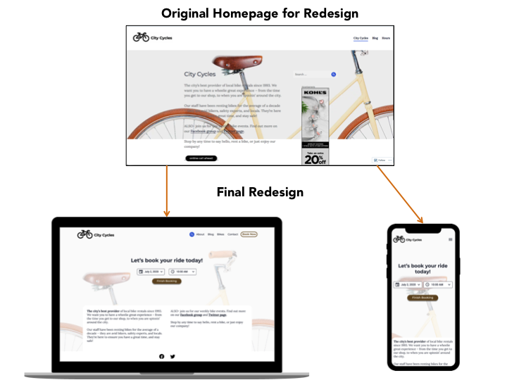
IMAGE — Original vs. First Iteration Mockup
I updated the navigation to more logical options via a card sorting exercise. I moved the search bar closer to the menu to improve visibility. I added large CTA buttons to draw the user’s focus to the most desired action stakeholders and users wanted — to make a reservation. Additionally, I added the CTA ‘Book Now’ button to the navigation so the reservation system could be easily accessed from other parts of the site. I relocated the introductory text as it was of secondary importance.
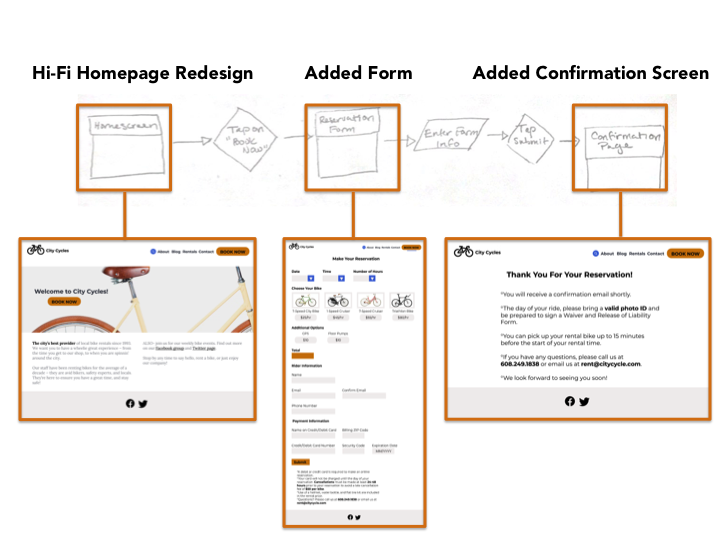
First Iteration — Updated Flow
My first iteration also focused on simplifying the user flow to match the typical mental model of a reservation system: Booking CTA > Reservation Form > Confirmation.
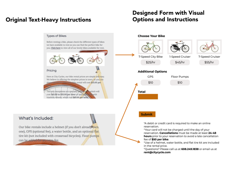
First Iteration — Convert Text–Heavy Instructions to Visual Options
I focused on converting the wall of text instructions to actionable options. What I could not convert to an actionable option, I used bolded text to support skimming.
First Iteration — Usability Test & Resulting Update
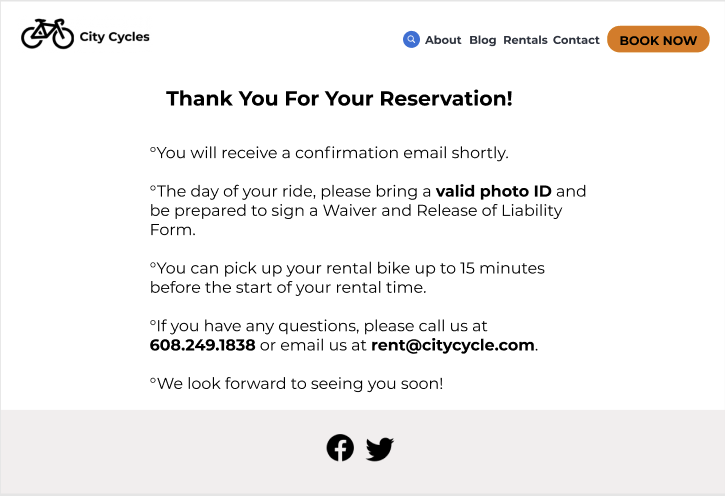
The Usability Test revealed a more personalized confirmation message was desired in order to make the user feel more secure that the reservation was received.
Usability Test Prototype
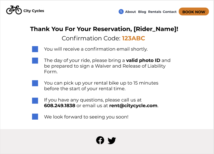
Prototype Updated Based on Usability Test Feedback
Second Iteration
I decided to revisit the reservation system to further enhance the experience, interaction design and mobile optimization, and explore the opportunities competitive analysis revealed: create a more flexible reservation system that allows patrons to book an hourly rate quickly.
Second Iteration — Homepage Update
Since the focus was on increasing online reservations, I decided to allow users to begin the reservation process from the landing page. I also wanted to keep most of the information above the fold.
Second Iteration — Desktop — Embraced Progressive Disclosure & Interaction Design
Again, I worked to keep everything above the fold and embraced interaction design to guide the user quickly through the options. I used a blue indicator box to provide the user with feedback: where they should focus their attention when the page loaded and after a choice was selected. I added social proof to make the user’s selection easier. I used progressive disclosure to shorten the form and a slide in motion between screens to make the user feel they are progressing through the process.
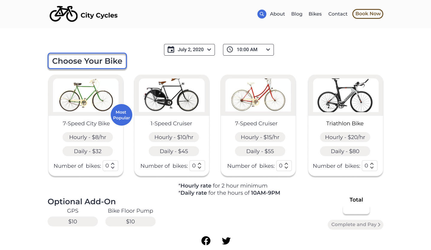
IMAGE — Indicator and social proof
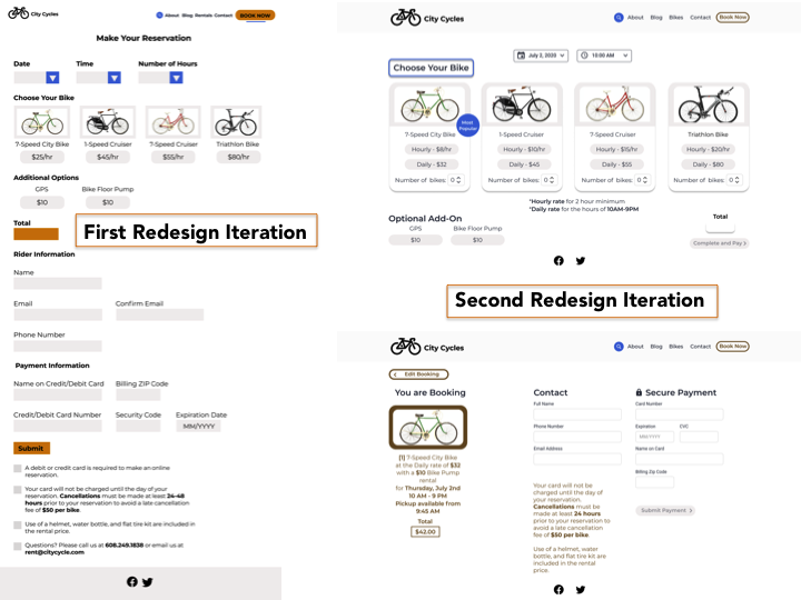
IMAGE — First Iteration vs. Second Iteration
GIF — Desktop Interaction
Second Iteration — Mobile Considerations
While horizontal scrolling allowed me to keep most of the second screen above the fold, I allowed for vertical scrolling in order to complete the contact and payment information. I thought this would allow for a responsive website that collects the user information in the same manner as the desktop site (i.e. there would be no need to maintain multiple sites as in an adaptive solution).
GIF — Horizontal Scrolling and Most of Second Screen above the Fold
GIF — Vertical Scrolling
Retrospective
Although I approached this project as that of a client with a modest budget, it was still difficult to determine what could be added, feature–wise, within such a budget. This was a good exercise to understand the importance of business strategy and how that can play a role in revamping offerings and how they are presented to customers. Additionally, this exercise emphasized the importance of conversations with stakeholders and developers. I would have collected more data to determine best offerings and considered exploring additional features that might set the company apart from competition. I attempted to make decisions with a developer in mind; however, it would have been helpful to further discuss, with a developer, whether my choices were efficient or time– or budget–friendly.